My Print and Visual Design Showcase
This collection serves less as a space to show off and more as an archive of fond memories. There are beautiful expressions of creativity and some dorky designs that are connected to nice memories. This is a place to enjoy.
#Contents
#2D Image Manipulation
These are products of a Photoshop contest. In every case, a stock image was provided and the result was judged by the community based on creativity and execution.
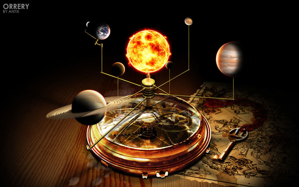
Orrery is a model of our solar system driven by a clockwork-like mechanism. The stock image was the pocket watch, without the transparency and gears. I always had a fascination with space and other worlds.
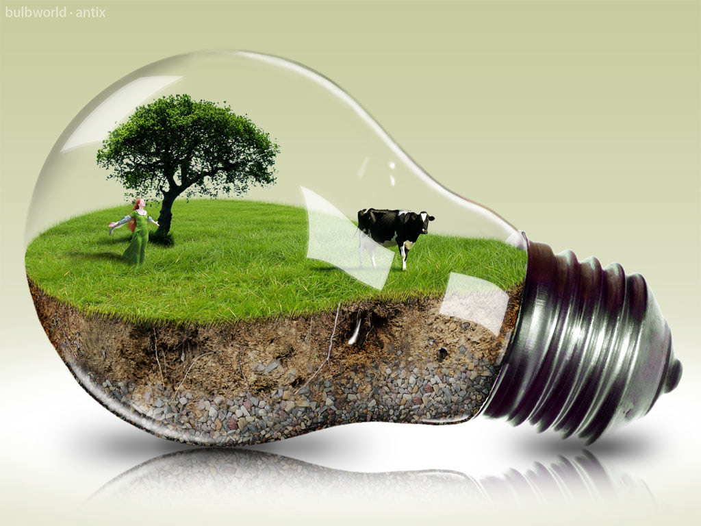
Bulbworld is, as can be surmised by the title, a tiny world in a lightbulb. The lightbulb was the stock image provided. I still remember getting a real lightbulb and holding it against my window in a thousand different ways to recreate the most photorealistic reflections on the glass.
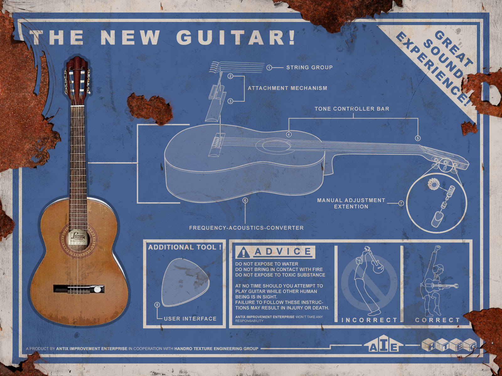
Guitar Manual may look a bit bland at first. The provided stock was a top-down picture of the guitar. My inspiration was this Team Fortress 2 art showing the building instructions for a benign sandwich in the style of a vintage-looking metal plaque advertisement. I especially love the outlined breakdown of the guitar and the small details at the bottom with specially crafted logos in the style of the time.
#3D Renders with Cinema4D
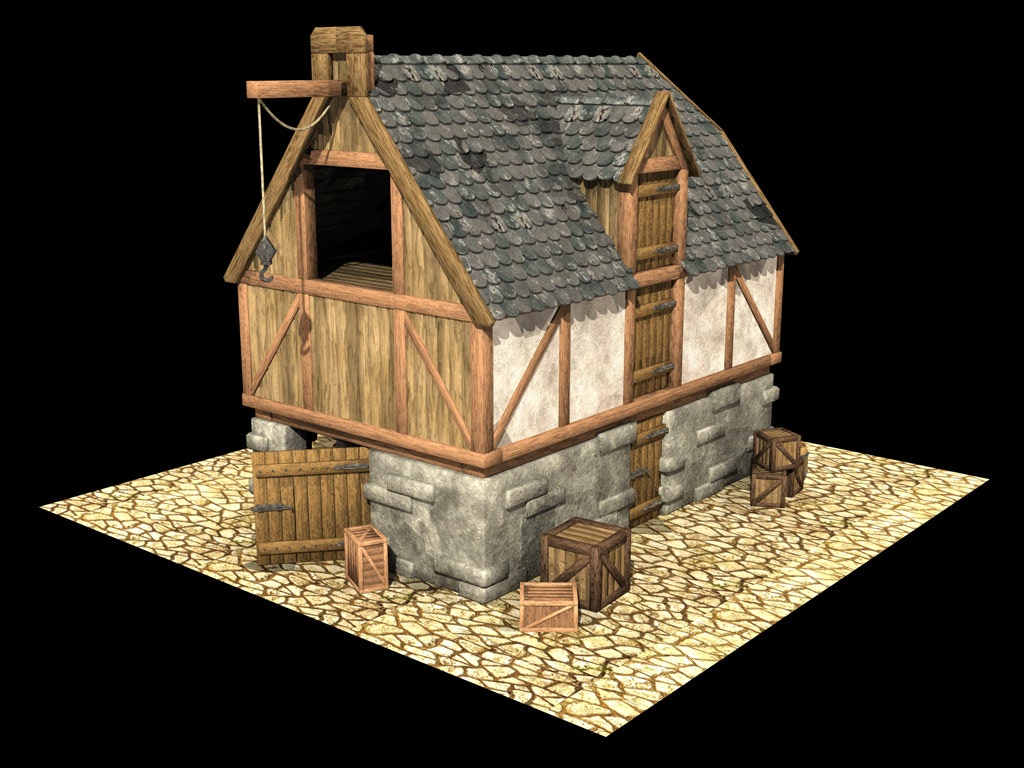
I gave myself the challenge to recreate simple real-world objects as faithful as possible. The fun part was to tweak the different surface materials until they felt just right.

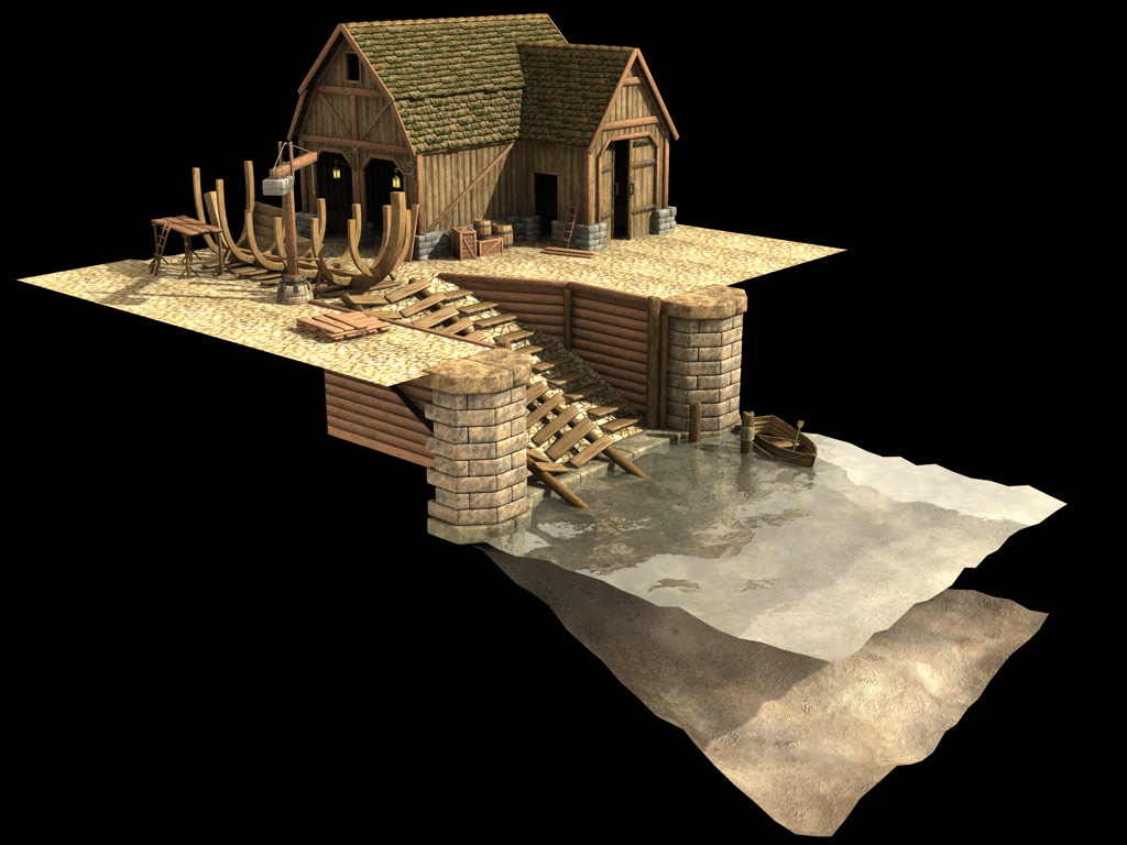
These two buildings were created for a harbor scene as part of a 3D artist contest. I really like the video game feel of these models. They won the contest.

#Print Design
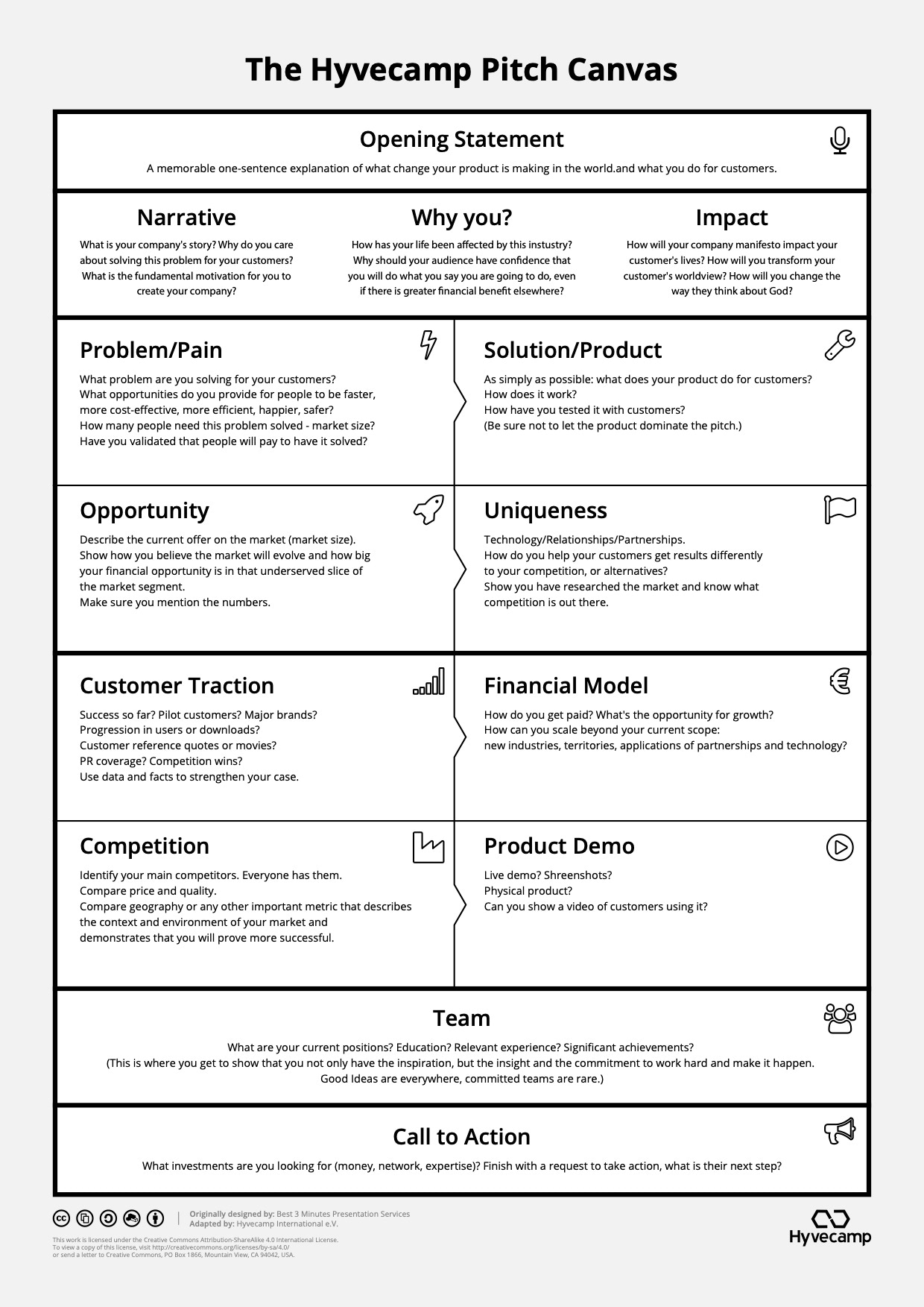
Print design is a discipline I rather enjoy. The art lies in conveying a set of information in the clearest and most simple manner possible while also being pleasing to the eye. Often there are very specific constraints like in the case of the Hyvecamp pitch canvas below that has to be printed on normal black and white laser printers as handouts in a conference setting.
Similar to user interface design, the challenge in print design lies not with what you see on the final page, but what was left out. Just as the author of the Little Prince fittingly said:
Perfection is achieved, not when there is nothing more to add, but when there is nothing left to take away.
– Antoine de Saint-Exupéry, Airman’s Odyssey
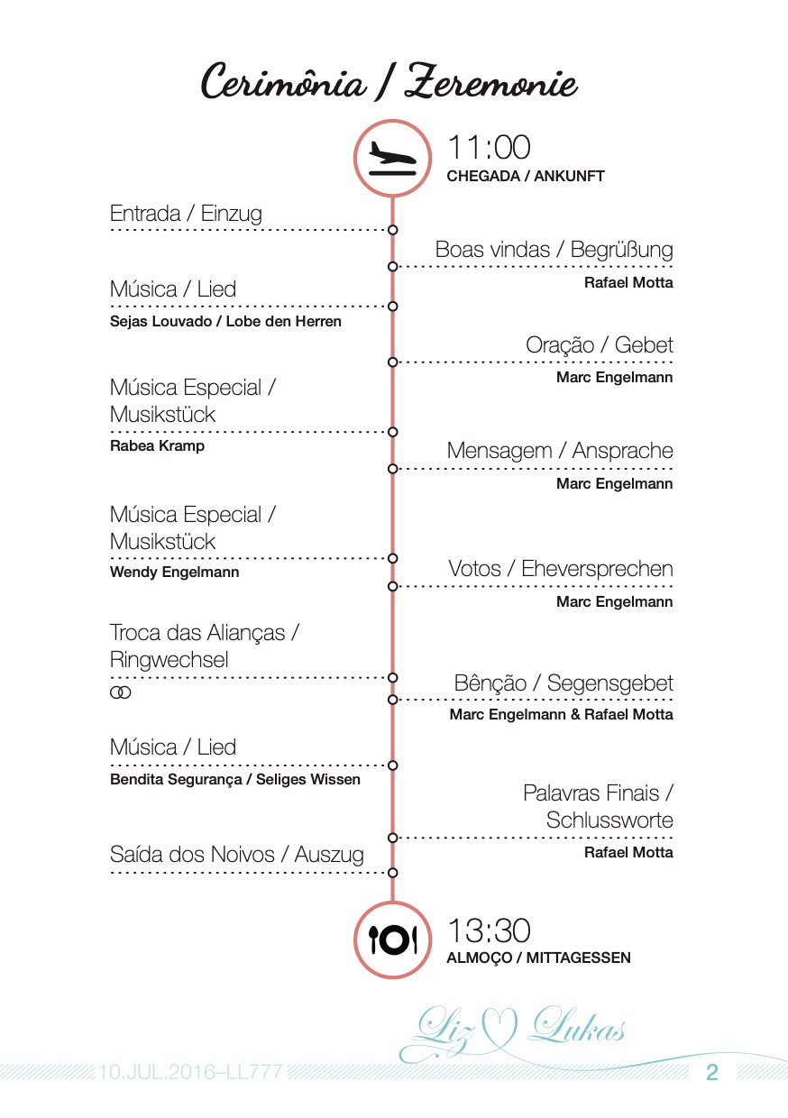
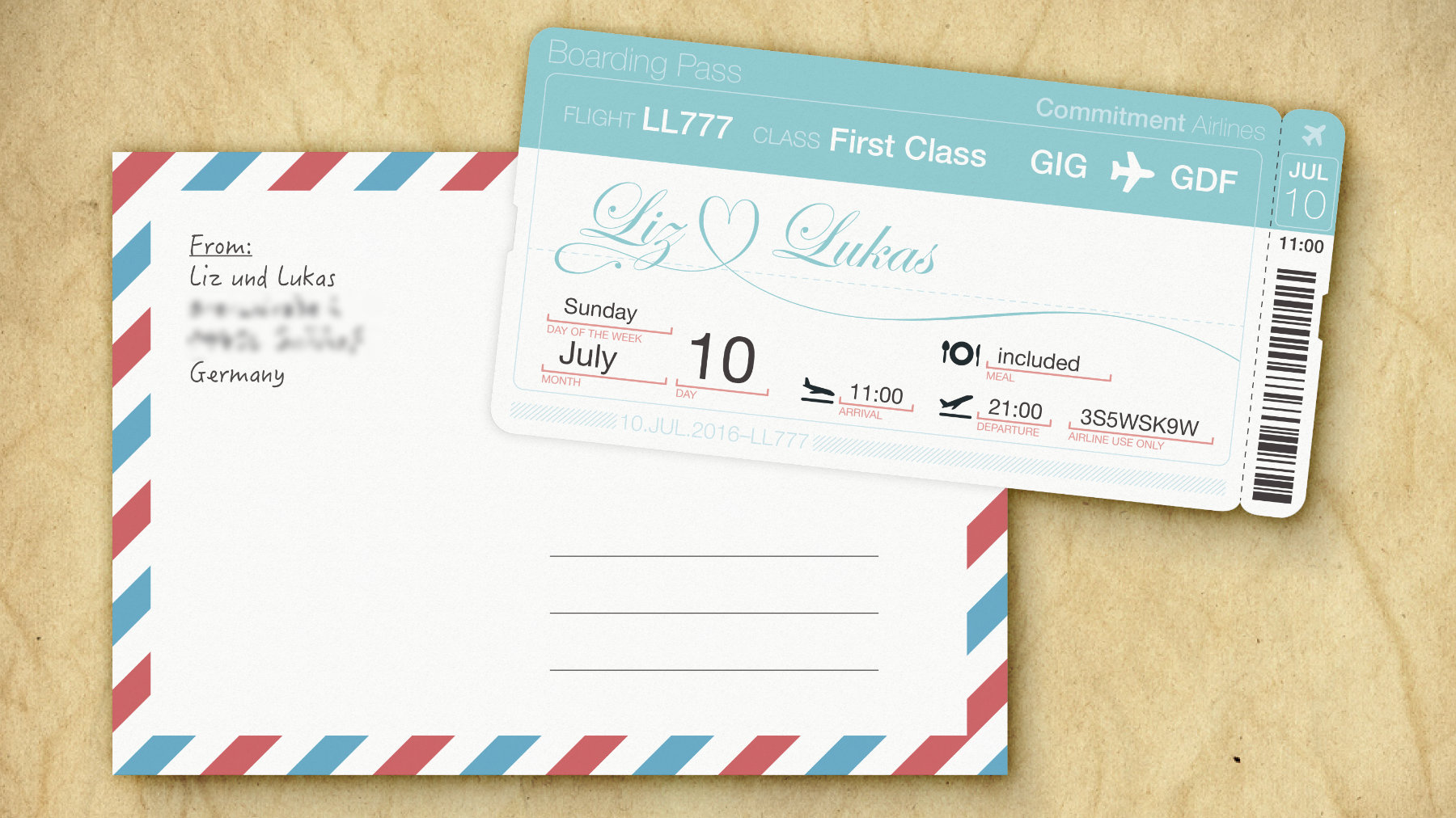
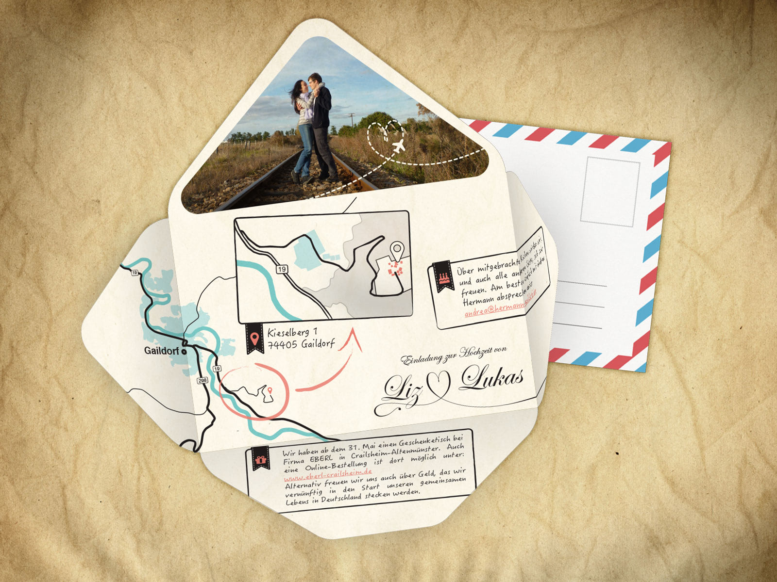
The best results an artist achieves is not when working for a client but when creating a piece for the sake of the piece itself. That’s why I included the invitation card for my wedding that is imitating an airplane boarding pass.
#Logo Design
This section is more for fond memories than showing off. A lot of work goes into a well-designed logo of which the casual observer may be oblivious due to its simple appearance.
The first logo was for a summer camp (great memories!). The second one was for an acquaintance’s business idea of a bakery, the design being a mix between a traditional 19th century and modern style. The latter two are for a website and the podcast of my wife respectively.
#User Interface Design
I love user interfaces, good user interfaces that is. The thought that somebody else would use an interface I crafted, read the information I organized and navigate a structure I created always filled me with joy. There are so many subtle details to a good user interface: the art of presenting information in the clearest way possible, the challenge of guiding users through error states or asynchronous operations, the frustration of observing people using workarounds that you never intended, and finally, the joy of watching others accomplishing their task on an intuitive interface is just like watching a child learning to walk.
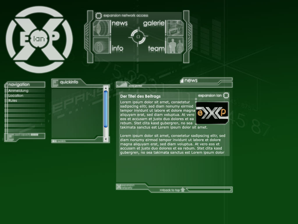
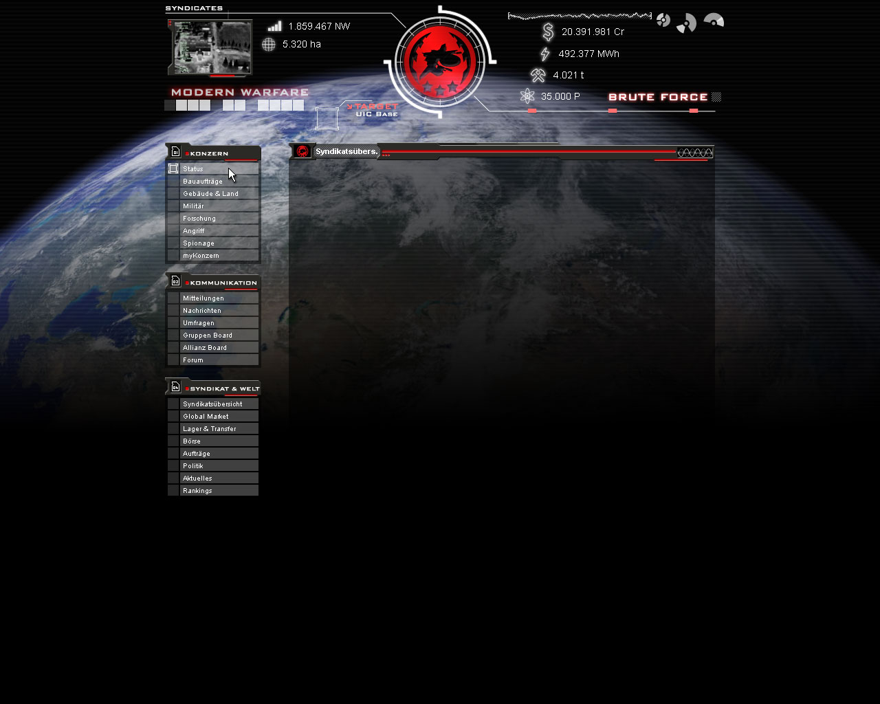
The first two designs are from my youth when the work was exclusively done for the passion of it. The first is a webpage for a LAN party we were organizing with the primary requirement that it needed to look awesome. The second was a UI theme for a browser game (yes, remember those?) I was playing back in the day called Syndicates. I just finished playing the original Call of Duty Modern Warefare and the impressions spilled over somewhat.
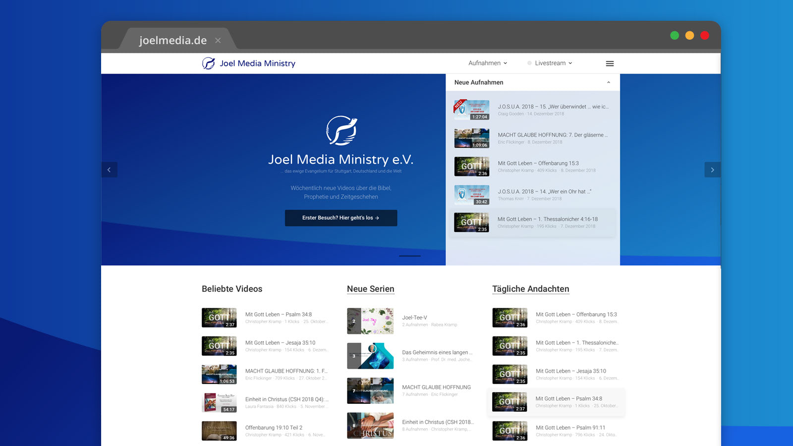
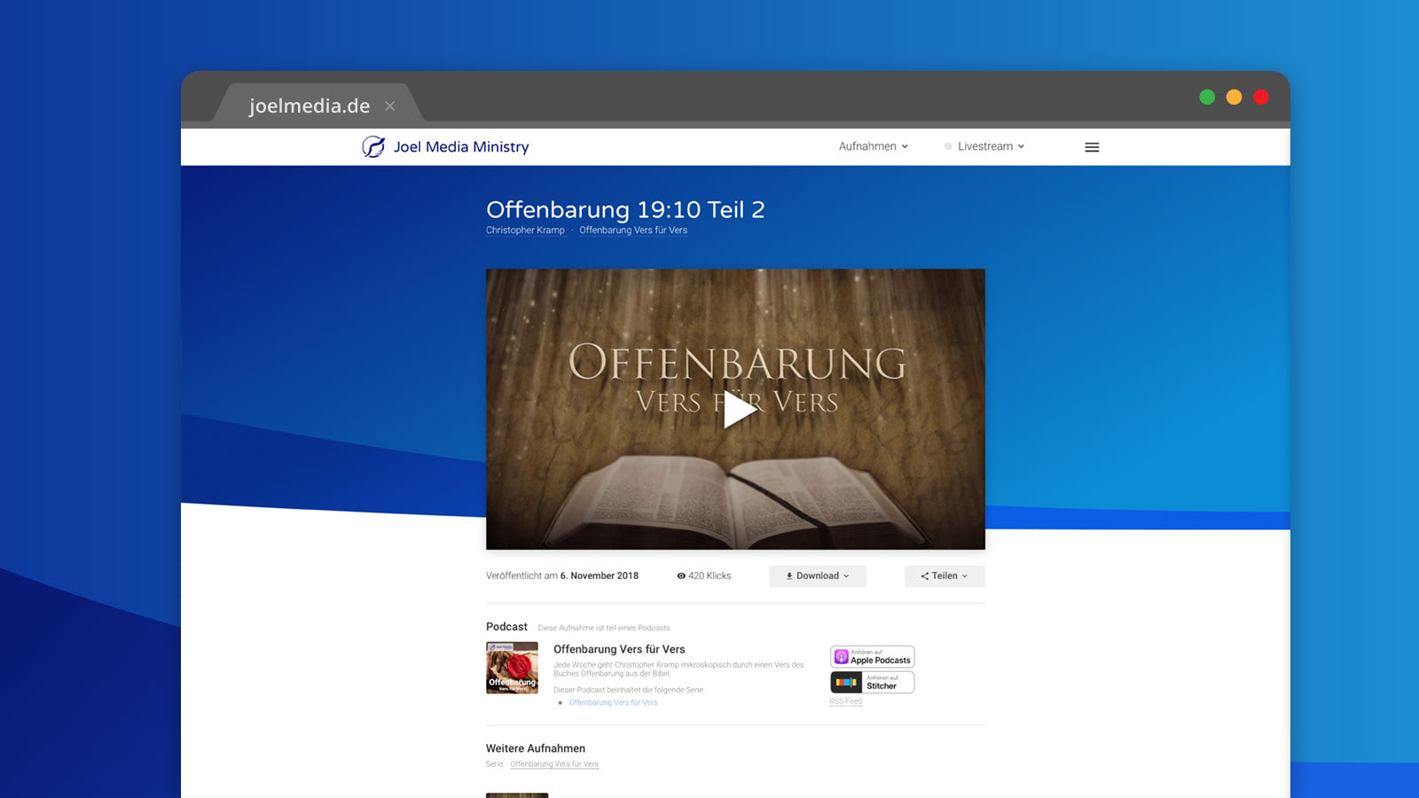
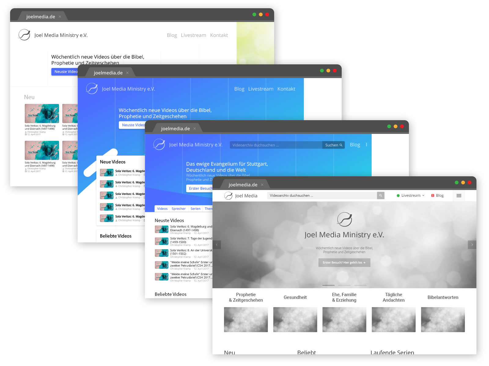
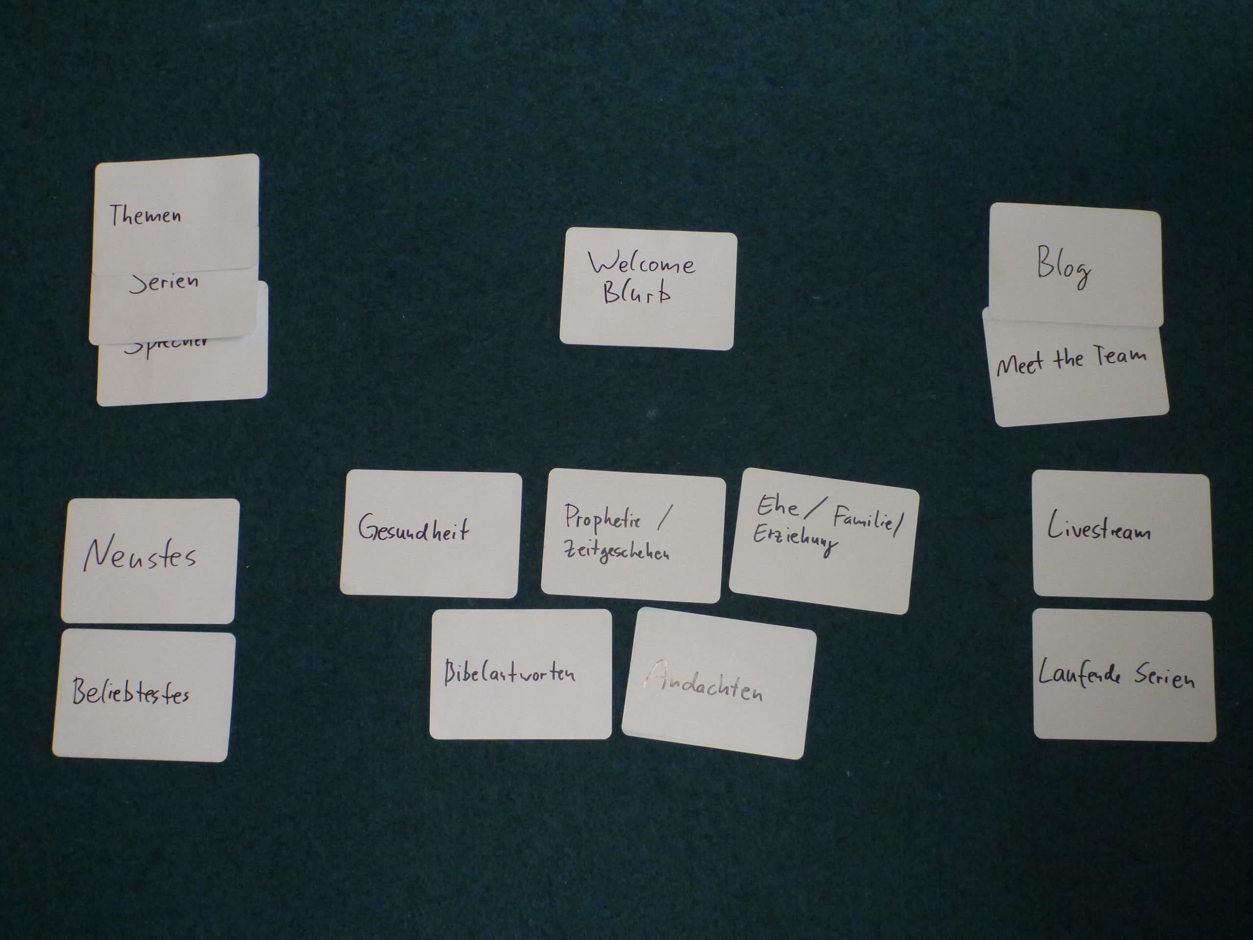
The Joel Media UI was a redesign of a video archive page that was a few years old by that time and saw a good number of monthly users. The design went through several iterations which produced a great end result. It was my first time creating a user interface with several stakeholders and existing users. It motivated me to read up on how the “pros” do it, and just like them, I started by writing words on paper cards and grouping them by topic. From that we derived our navigation and sitemap, and only then did Adobe Illustrator come to bear. It was a great project and taught me a lot.
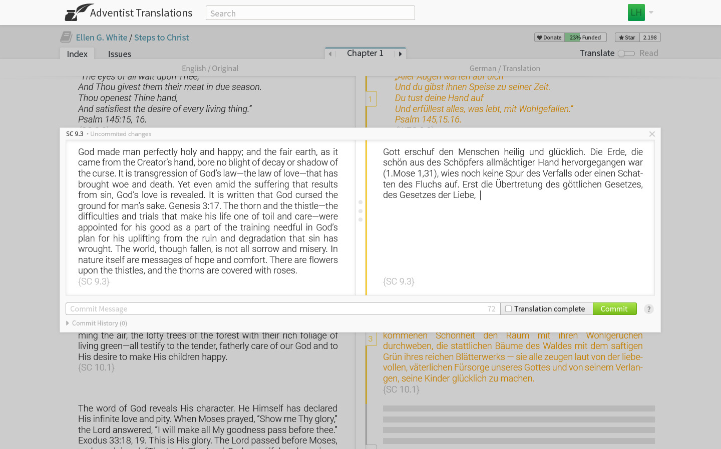
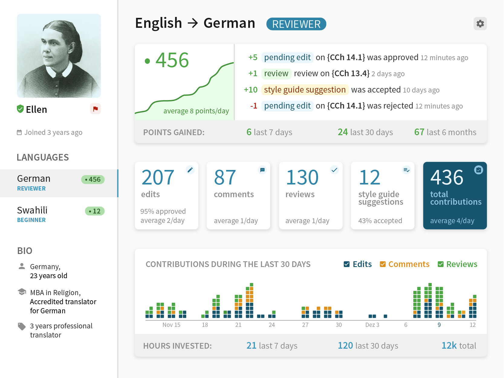
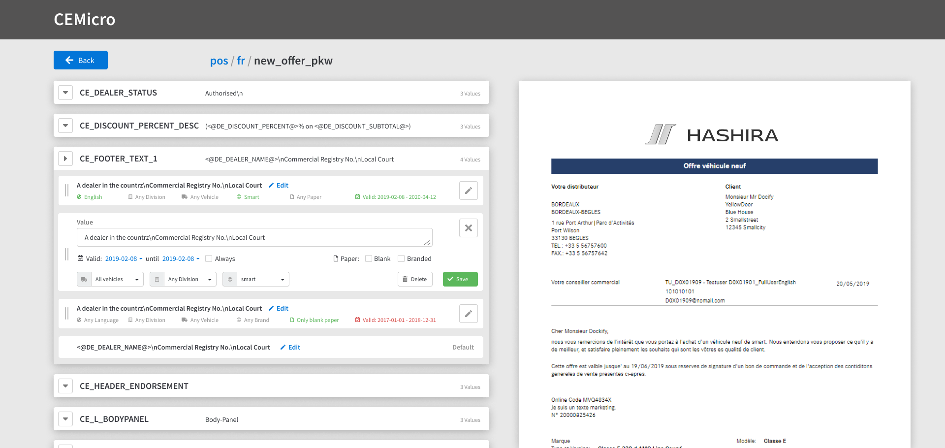
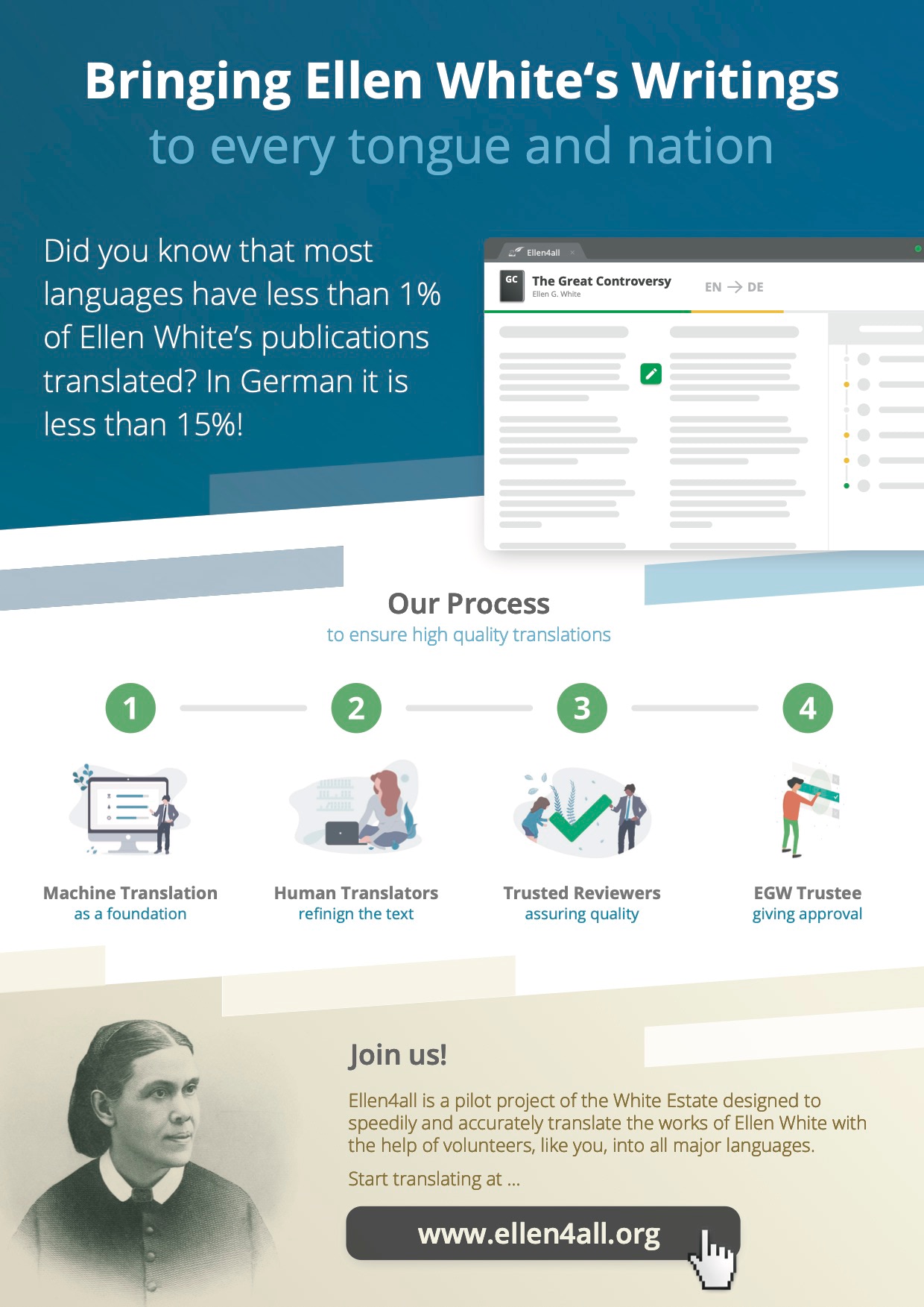
The latter three images are from more recent projects. The first two are from the prototyping phase of Ellen4all, a crowd translation platform. The last is from a project connected to my undergraduate thesis. I included them not because they are the most pretty, but because of the functional challenge they posed. The translation website has since gone through more iterations making it even simpler to use. Maybe I will write a separate post about it one day. CEMicro is extracting existing functionality from a point of sales software of a big car maker. As often the case with such software it has a feature set like a Swiss army knife with the usability of an income tax report. Even after boiling it down to as simple an interface as I could come up with the first impression is still daunting. But, to my personal joy, the existing users immediately understood how to use it. So there is that.